Project Type:
Launched product
Tools:
Figma, Adobe Photoshop, Adobe Illustrator, Adobe Lightroom, Adobe Premiere Pro
My Role:
I used Figma to build the wireframe for both the desktop and mobile platforms. I also used Adobe Photoshop and Adobe Illustrator create the graphic illustrations and banners.
Description:
Designed an Amazon storefront page for Botanik Herbs and Tea and focused on selling a singular product (Single Origin Matcha). Created cohesive branding with the new aesthetic built on the main website and instagram page.


Persona
Guiding Questions:
What are the goals of this Amazon Storefront?
Promote a Botanik products and increase sales.
What are some of the characteristics of the target audience?
Care for the environment and prefer a healthy lifestyle.
How do I plan to target this specific audience?
I plan to target this audience by emphasizing the importance of how Botanik products are sustainably grown. In addition, using hero images to capture the attention of the viewer.
Empathy Map
How did the personas and empathy map affect the design process?
I wanted to form a deeper understanding of our users' goals, needs, experiences, and behaviors. So, I created personas and an empathy map. They were based on user interviews and surveys, and we kept updating them throughout the project as we gathered more data. We used these personas whenever we wanted to step out of ourselves and reconsider our initial ideas.
UX Research
Design research
- Websites within this genre appear more legitimate if they utilize professional looking fonts and there is a clear hierarchy between the font sizes.
- The Coca-Cola storefront did a great job of highlighting the important message through larger font sizes. The continuous use of red in every image and video builds a strong connection throughout the page.
- The mix of videos and still images makes the page more interactive and alive.
Design research
- This storefront design focuses on a singular product and does not have any pages besides the home page. There is little information on the product itself but the use of full sized images draws the attention well on the product.
- Utilizes the product in the header image instead of promoting the brand. This was very unique since most of the headers were all brand focused rather than the product.
Design research
- The Casetify storefront created a very unique graphic for the header image. It breaks boundaries and makes the page seem more alive. This design is well inline with the creative products that Casetify sells.
- All the hero images are very bright and attention grabbing. Unlike the other sites, Casetify focuses on using full sized images only and does not split the screen.
Visual Design
Main Elements
The targeted audience were women in their 20-30s, I implemented a soft color palette and aesthetically pleasing illustrations to make the website more welcoming. I chose to use the same font used in the official website (Futura, Sunmora) for branding puropses. I also decided to implement a hero image at the top to capture the attention of the audience.
User interface
Main Elements
I implemented the Don Norman design principles into this website design. For example, in terms of visibility, I made the clickable buttons very prominent and obvious so that the functions are visible and makes it easy to use.
Ideation
Idea Sketch 1
Created a general idea of the storefront design with brand image in mind. Focused on using the same design aesthetic created on the official website and Instagram page to have cohesive branding.
Idea Sketch 2
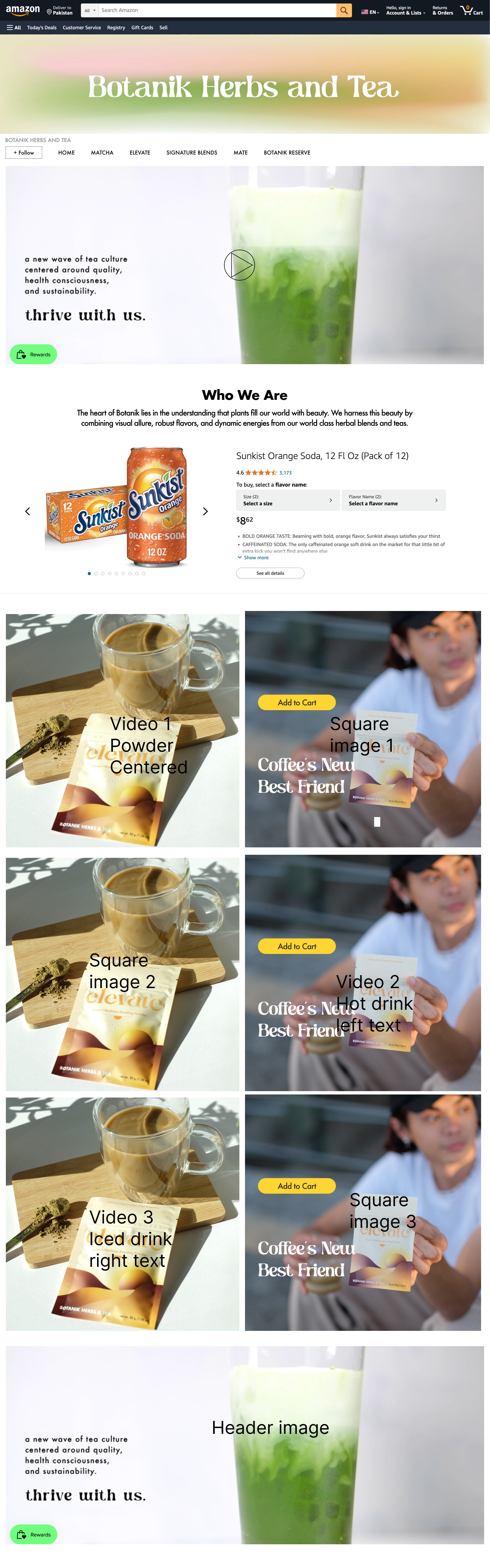
After receiving feedback, our team decided to focus on a singular product (single origin matcha) for the Amazon page, and then add more products in the future. Also, we decided to use a mix of images and product videos to make the page more interactive.
Wireframes
Using Adobe Illustrator , I translated my first sketches into low-fidelity wireframes. Then, I improved them by adding a few relevant stock images and copies. At this stage, the wireframes were defined enough for some user testing. Based on 2 tests, I’ve made a few alternations and moved on to creating high-fidelity prototypes.
Storefront Narrative
1. Header
- Branding
2. Main Navigation
- Navigation bar
- Logo
3. Section - Video
- Branding
- Call to action
4. Section - Product
- Product information
- Primary call to action
5. Section - Brand
- Video
- Promotional graphic
- Hero image
6. Footer
- Contact information
- Secondary call to action
Product Narrative
1. Product
- Single Origin Matcha
2. From the brand
- Logo
- Carousel
- Branding
3. Product Description
- Different selling point for each image
- Hero image
4. Footer
- Contact information
- Secondary call to action
Video Editing
Tools: Adobe After Effects
I arranged and trimmed the clips as needed, then adjusted their position, scale, and opacity using the Transform tools. I added effects like color correction and transitions to enhance the visuals. Once everything was set, I previewed the timeline to ensure it flowed well, then exported the final video through Adobe Media Encoder for high quality. This approach allowed me to be both creative and precise with my edits.
Usability Testing
I created a fully-functional, high-fidelity prototype of the new flows using Figma. At the same time, I started recruiting subjects for the test who fit our criteria. I conducted 2 usability tests and after the second round, I started iterating on the issues that were identified.

Issue 01: The page was not interactive with the customers.
Through the usability test, I discovered that the page was not interactive enough with the customers since there was only still images/graphics being used. Both subjects found that it would be helpful to have videos based on the product. This would give a better sense of the real life product.
Solution 01: Use a mix of videos and images
Amazon storefront designs allows for large sized images and videos to be mixed in one page. So, we decided to rotate between image and video to make the page more interactive.
Issue 02: Too many products being promoted
Since this was our first time making a storefront, the team decided to focus on selling a singular product rather than selling all the Botanik products. The subjects were overwhelmed with the different categories and tea options, so it was hard to find the right product to buy.
Solution 02: Focus on one product
Since the Single Origin Matcha was the best seller product, we decided on starting promoting this product first and then slowly launching all the products onto the Amazon page at a later time.
Secondary Working Wireframe
Amazon Storefront Design

Product Design

Final Design
Amazon Storefront Design

Product Design

Desktop View

.jpg)


.jpg)