A new website for the Botanik Herbs & Tea company to implement new design trends and follow a closer target audience.
Project Type:
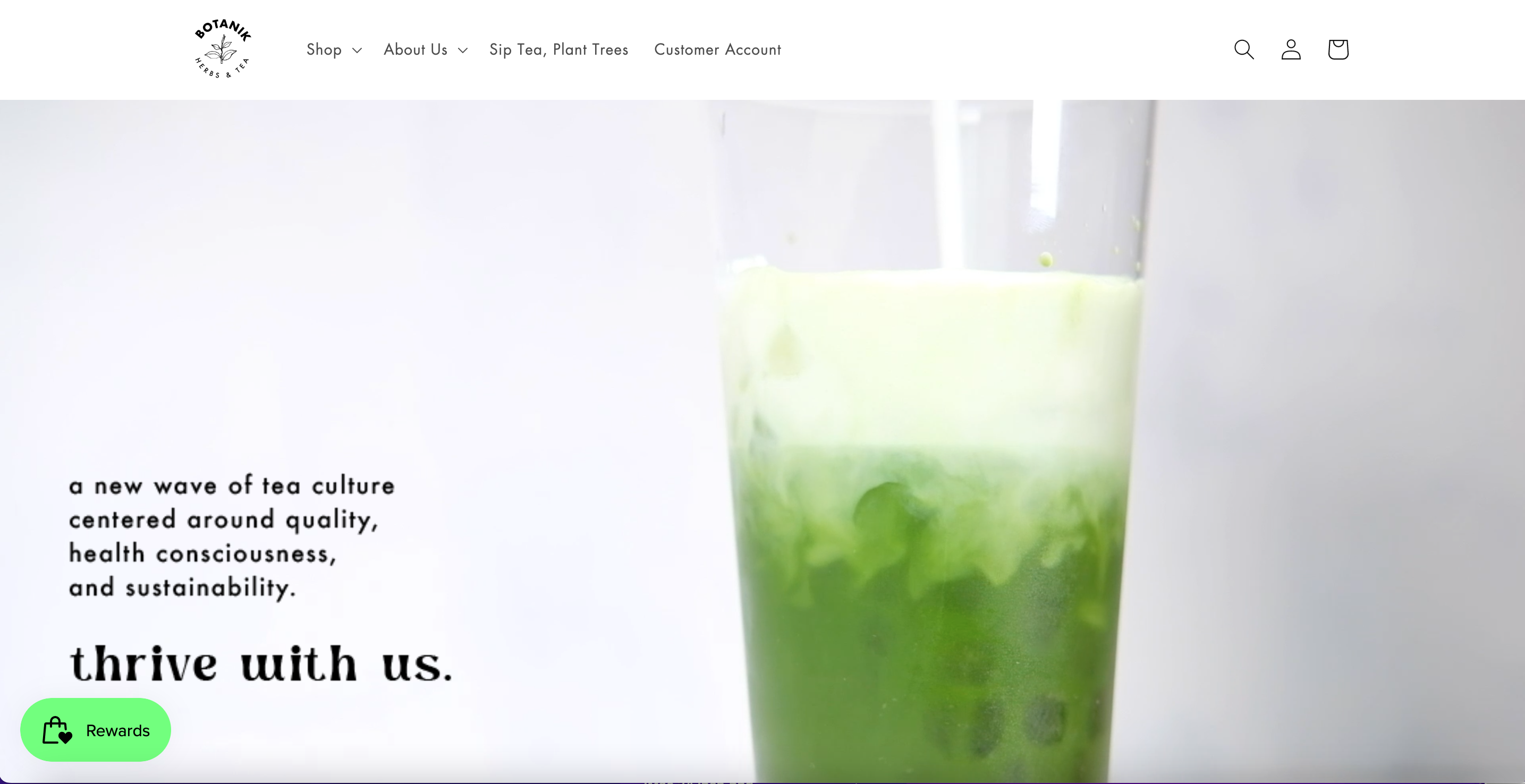
Launched product
My Role: I used Figma to build the wireframe for both the desktop and mobile platforms. I developed a new color scheme and incorporated certain fonts to match the new design. I was also involved in package design for cohesive branding with the website and products.
Botanik is a tea company originated in Davis and is most popular for its matcha products.
Problem Framing
Problem
The current design of the website is out of trend and external links to the products makes it confusing for the users.
How might we redesign the company's website to better meet the target audience, keep up with current trends, and deliver an easier user experience?
Timeline
Research:
I began the design process by conducting primary and secondary research in order to better understand the company and how consumers might respond to this particular brand of tea.
Target Audience: Women in 20-30s with all different cultural backgrounds Main audience: Students/residents of Davis
Core Values: “Understanding that plants fill our world with beauty” Emphasize on bringing natural ingredients to create blends and tea Themes: Nature, natural, clean, organic, eco-friendly, healthy
Most liked and viewed posts
1. Very active, allows the viewers to participate and be included in the community. 2. Grabs the attention of the viewers through active motion (video).
3. Trending content (Tiktok platform)
Most unliked and viewed posts
1. Still images, no active motion 2. No words on the images just description in the comments section.
3. A pinterest vibe, a past trend
Priorities and Pain Points
Users were having a hard time purchasing products
There are external links to the products which made the website confusing for the users.
The website's design was not cohesive with the social media accounts
Users felt disconnected. The social media accounts were comparably well designed. There was a lot more color usage and was more playful.
Website is not atheistically pleasing
There were too many word heavy pages and inconsistencies in the color scheme.
Interviews with Costumers
Solution
Create a cohesive branding!
Incorporate a cohesive design throughout the website, packing and social media accounts. The overall design of the website was based on the company's tiktok account since it was one of the major factors in the increase of revenue. This idea allowed for the website to be more catered towards our target audience, and keep up with design trends.
Visual Design
I Incorporated a minimal color usage throughout the whole site. Green was used as a highlight color to match the popular matcha product sold.I utilized Futura since it is one of the most trending fonts for users in their late 20s to 30s which matched the target audience.
Package Design
I designed the packaging to match the playful atmosphere of the tiktok account. Through interviews with the users I learned that the customers enjoys a gradient rather than solid colors. The costumers preferred a flowy form of design in comparison to solid shapes.
I combined my earlier research with data in order to create a persona representative of the target market.
Inspiration
Emotional Benefits of incorporating color
Color meaning (sky blue) - Open spaces, freedom, imagination, inspiration. Feeling it evokes: trust, calmness, serenity, peaceful - This color is very neutral and can be used to target a wide wide range of customers ranging from teens to late 40s.
Color meaning (green) - natural, free, nature, energy.
- Feeling it evokes: Respect, wealth, hopefulness.
Sitemap
Low Mobile Lo/Mid-fi
Focused on the text size, font, and layout.
Website features
Shop for your favorite tea.
Products include matcha, signature blend, mate and botanik reserve.
Join the Botanik Community
Create an account to gain exclusive benefits and discounts.
Learn about the cause.
Provides ways to get involved and contribute to the environment.
Website features
Shop for your favorite tea.
Products include matcha, signature blend, mate and botanik reserve.
Learn about the cause.
Provides ways to get involved and contribute to the environment.
Learn about the cause.
We’ll identify and assess the seriousness of your pets health issues and give you a plan to action.
Join the Botanik Community
Create an account to gain exclusive benefits and discounts.
Final Product
Outcomes
Reduced time spent on purchasing products
The time spent on purchasing a product went down by 35%. After the new design of the website it takes about 2 mins for a user to purchase an item in the chart once its chosen.
Reduced support calls
The number of average support calls drastically decreased by 90%.
Increase in sales
The time spent on purchasing a product went down by 35%. After the new design of the website it takes about 2 mins for a user to purchase an item in the chart once its chosen.
What I learned
Be agile
Our approach to redesigning the website was successful because we designed the website with research and testing, then iterated after each key finding.
Simplicity is key
Being able to keep the same design components throughout all the products allowed for a cleaner brand image as well as identity for the company to be remembered as.
Be detailed
Coming up with a specific color scheme and font to use for the website really increased the aesthetic viewpoint for the website.